
“Legend of the Guardians: The Owls of
Ga'Hoole” created by Animal Logic is perhaps my favourite movie.
Despite being biased to animation and anything with talking animals,
this movie really hit the nail on the head for me. Story aside, the
shots themselves are beautiful. As opposed to the previous post, the
colour schemes used in this film are more subdued and passive, but
they go a long way to contributing to the story. The image below is
from a moment in the film where the owl on the right has escaped from
a horrible place, and has just found an owl he doesn't know (on the
left), who lives in the area. Straight away the colour reinforces the
notion of being in an alien world. The owl on the left 'Digger' takes
on the colours of the environment much more than Soren, the
right-hand owl. The blues and broken hues of the background seem
evident more in Digger's Colour than in Soren's. There surroundings
are lighter and less saturated because of the fog, whereas the
characters themselves have a darker more saturated palette, making
them stand out and look unwelcome in the frosty scenery. Although
blue and orange are complimentary, in this case that goes towards
distancing Soren from the environment, which is exactly the idea as
he stands out as though he doesn't belong. This is a part eerie
moment in the film, and the less saturated broken colours add to the
uncertainty and alien feel of the situation.

Winnie the Pooh is known for it's
charming watercolour imagery both in the books and in the scenery of
the cartoon version. This piece of concept work for the location
“Pooh Sticks Bridge” shows the same qualities in it's colour
scheme. Although it can be said that trees are brown, leaves are
green, etc, this piece packs every element full of colour. The shaded
areas are soften not only by the nature of the medium, but also in
the colours found within. For instance, the shaded areas of the tree
trunks, take on the blue from the sky, as do a lot of other elements
in the piece such as the bridge and even the leaves in places. This
colour combination not only gives way to an appropriate stone for
darker areas, but creates a wonderful atmospheric haze in setting
that lends to that fuzzy summer's day feeling. The piece overall is
very light and desaturated, with the more darker areas such as the
roots of the tree of the left serving as slight tints to contrast
with the surrounding elements. The piece lacks any true darkness
because of the light and happy mood it is portraying.
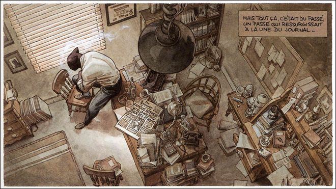
Flaunting an atmospheric sepia pallet,
Juanjo Gaurnido's 'BLACKSAD' comics provide an excellent example of
how to lead the eye to points of interest using opposing values and
contrasting lighting set-ups. The comic's pages are very detailed and
painstakingly produced, so to direct the readers attention to the
vital parts of each scenario, value is heavily relied on to give
focus amongst the clutter.. In this instance, the elements closer to
the light of the window have a more solid colour, whereas areas such
as the corner of the room sport darker shades of red and green. Some
aspects such as the notice board on the far right, make used of a
very subtle mix of colours that distinguish from each other by a very
small margin, making the reader deem them as something of little
interest. However, John Blacksad's black fur is a strong dark tint
amongst the much lighter values surrounding it, this establishes him
as the main point of focus, and so the reader's attention will rest
mostly on the feline figure.
No comments:
Post a Comment